Associate Professor of Mathematics and Statistics Ari Stern uses data accumulated from public testimony to develop improved standards for community representation in political redistricting.
Every ten years, the boundaries of electoral districts are redrawn to reflect shifting demographics in America. Ideally, this process of redistricting ensures that constituents with common interests will be properly represented in the U.S. House of Representatives.
In reality, politicians often use their authority over the redistricting process to draw district lines prioritizing their chances of re-election. This practice, known as gerrymandering, has drawn increasing critical attention in recent years. According to Ari Stern, Associate Professor of Mathematics and Statistics, math can play an important role in bringing it to an end.

In a new study, Stern and colleagues have developed a data-driven method for measuring how well communities are represented by district maps.
“When applied to gerrymandering, the procedural transparency of mathematics can allow people to convincingly advocate for fair maps,” said Stern. “Because mathematical tools are reproducible, two different people applying the same methodology to the same demographic data will come to the same conclusion about a map.”
Often, legal battles over gerrymandering involve two sides arguing from subjective standpoints that are impossible to test. “One side says, ‘This is a perfectly reasonable-looking map,’ and the other side says, ‘This is a terrible map.’ And there’s no test to determine whether the map actually achieved the goals that people wanted it to; there’s no way to measure or quantify these things,” said Stern.
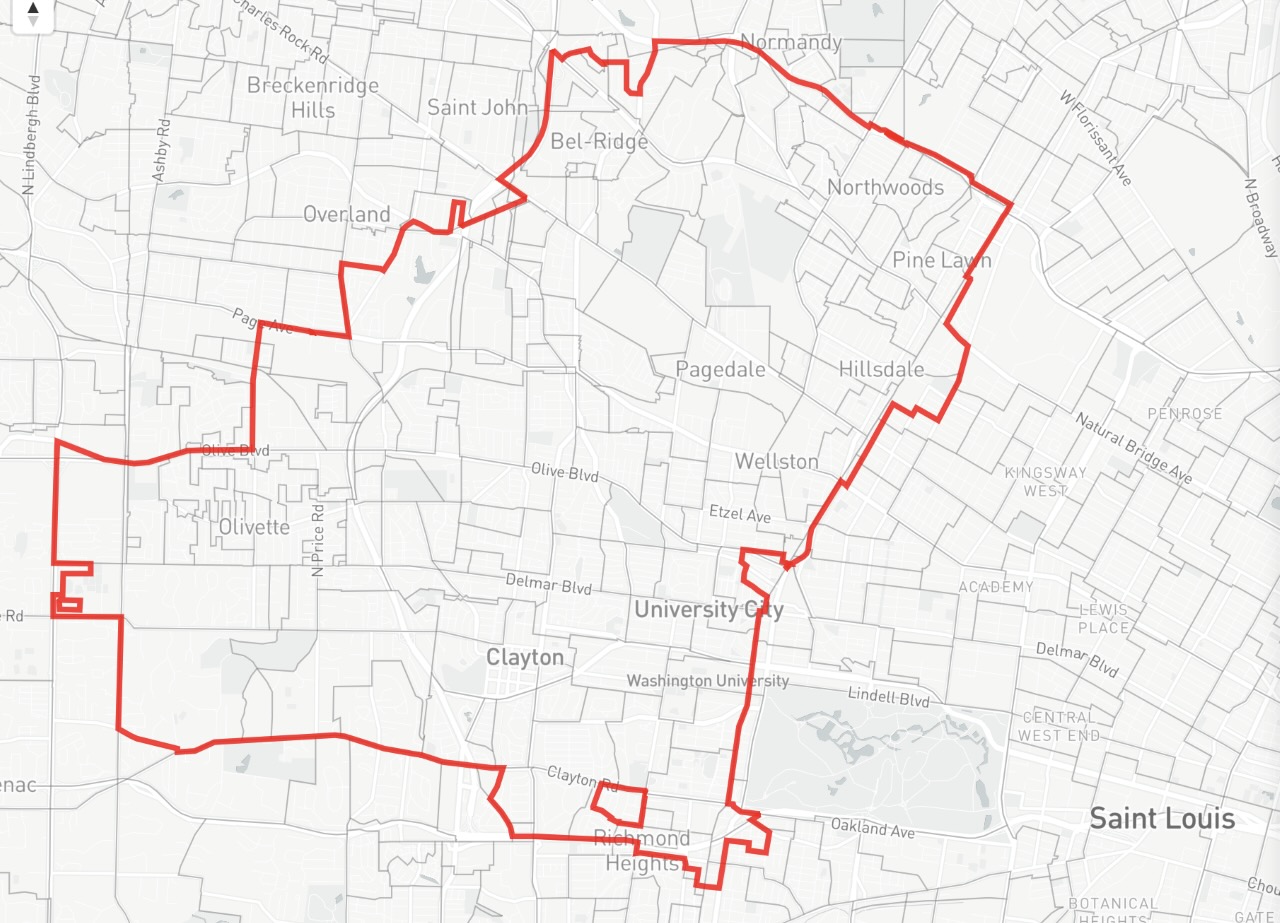
To address this problem, Stern and coauthors worked with a team of computer scientists, geographers, and community groups to create a transparent, reproducible method for an important part of the redistricting process: identifying “communities of interest” that, according to traditional districting principles and many state laws, should be kept together.
“The idea behind communities of interest is that people with shared political stakes in a region should not be split up when district lines are drawn,” said Stern. “But from a quantitative point of view, there’s no actual standard for determining what qualifies as a community of interest. As a result, politicians can draw lines to produce other outcomes – maybe to create a partisan or racial gerrymander – and justify it after the fact by saying there are communities which just happen to line up with their map.”
Developing a quantitative standard for maps, therefore, would allow good-faith map drawers to properly accommodate communities of interest, while also closing a loophole for gerrymandering.
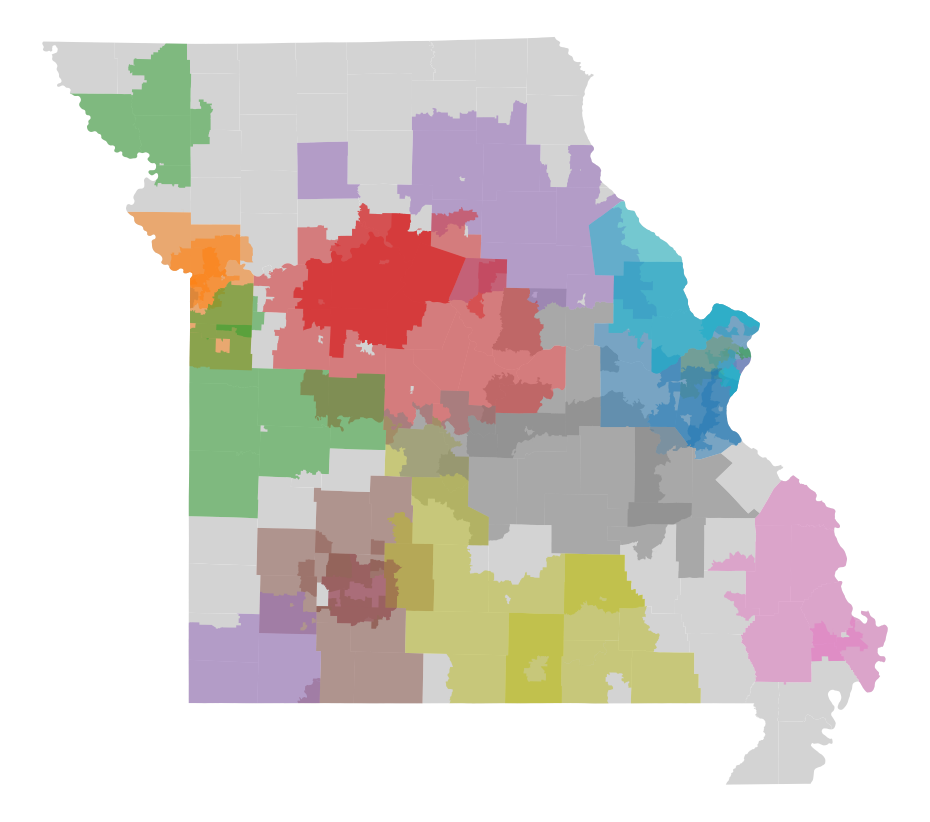
The technique developed by Stern’s team seeks to account for as many community voices as possible through an app called Districtr, which was created by Stern’s collaborators. In this app, anybody can draw and describe the boundaries of their own community, along with issues the community cares about, and submit this testimony for official consideration. By partnering with various community organizations and official redistricting offices, the team collected such testimonies from thousands of communities across the country.
“For each state, we took all these different maps and developed new algorithms that clustered them into common communities,” said Stern. “If there were a lot of maps overlapping in the same region, we could group those together and conclude that they described a single community. We could then use the text descriptions people had added to create subclusters with more specific shared interests.”
The team was especially innovative in how they measured distance between the maps they compared. “We used data from the U.S. Census to break up each state into what are called block groups,” said Stern. “A single block on a map could be really big if it's in a sparsely populated rural area, or it could be tiny on the map if it's in a densely populated urban area.”
Rather than measuring the differences between maps in terms of miles, Stern’s team counted the number of blocks between distinct points on the maps. This allowed the researchers to correct for population density as they determined the boundaries of various communities of interest.
When Stern’s team applied their method to well-defined communities, they found it highly successful in reproducing established boundaries. Knowing this, they are confident that community maps created by their method could provide a useful tool for improving the redistricting process.
“The technique we developed could be used to point out when a proposed map can or cannot be justified on the grounds of preserving a community,” said Stern.
“I think people who are interested in contesting a map that has been drawn for their community can use this tool to advocate for a fairer map,” he continued. “It’s really persuasive to be able to say, ‘Here's how I know that map is unfair. If you apply my method, you’ll come to the same conclusion.’”